8. Matisse: An Inclusive Art Guide
Publication Design ︎ Print Production ︎ Typography
2020
Matisse: The Cut Outs is an interactive art guide that challenges typical printed matter aimed at the partially sighted. Utilizing embossing, QR codes and a graphic language which is playful, yet practical, results in an inclusive, enriching print-based experience that carefully considers my intended audience’s needs.


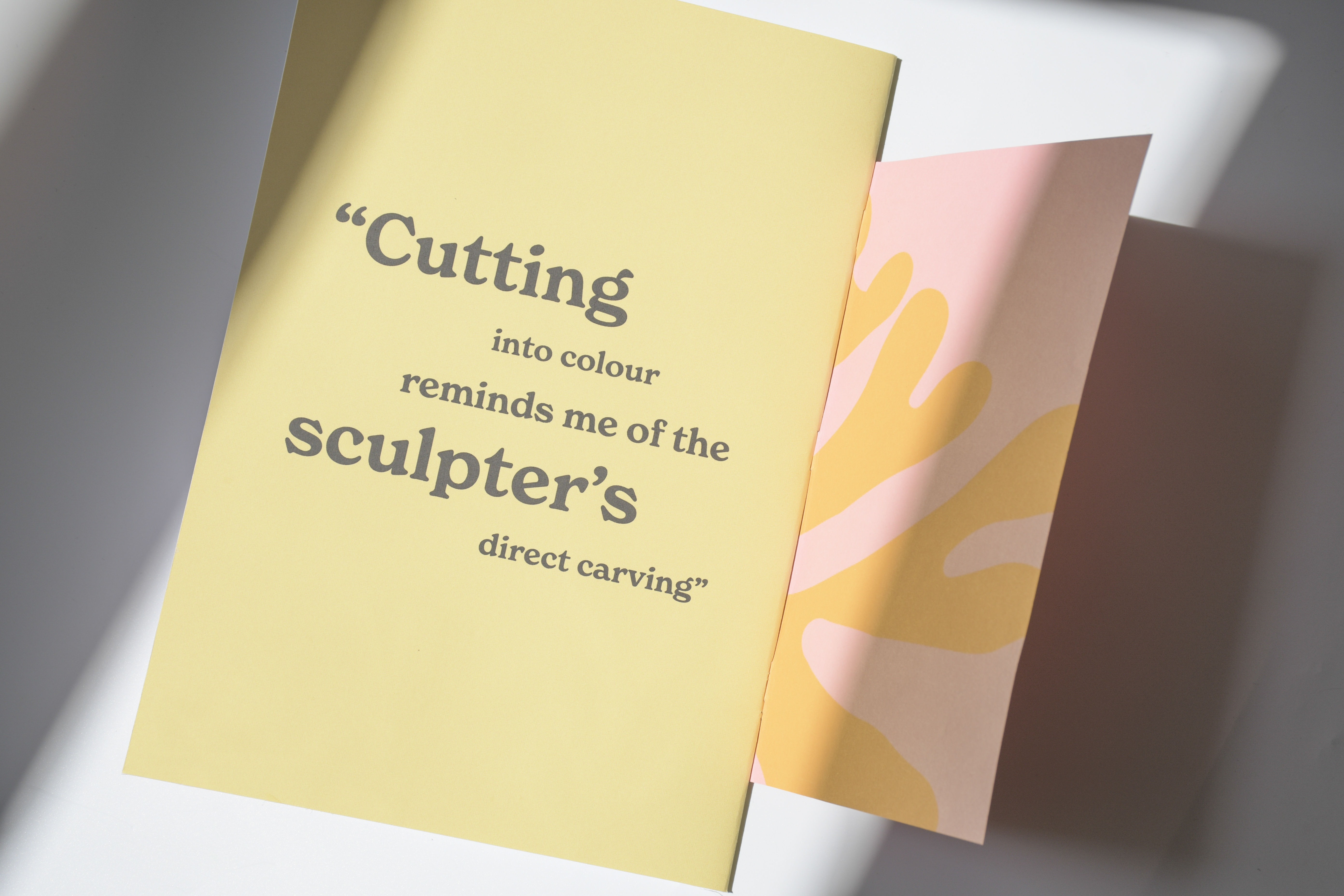
297 mm x 210 mm ︎ Saddle-Stitched ︎ Inkjet Printed ︎ Embossed Inserts
I’m a regular gallery and museum visitor, but every time I visit a new exhibition, I can’t help but notice how exhibition guides and art books aimed at the partially sighted completely lack personality and rarely embody the visual language which they are describing.
I felt compelled to create a project addressing this issue, researching, and designing a tactile large format guide that would allow partially sighted individuals to enjoy and learn about the world of an artist as much as their full-sighted friends and family.
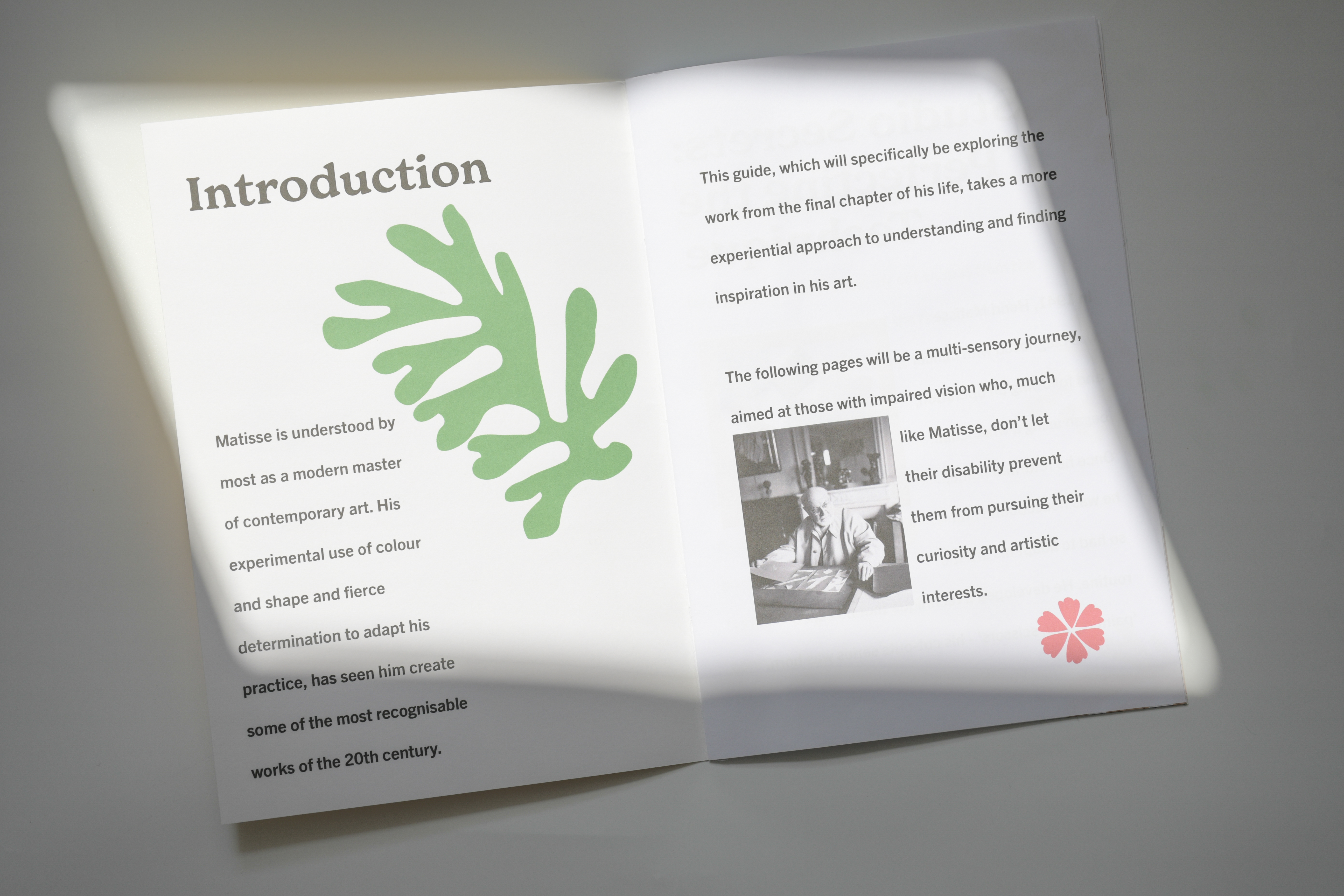

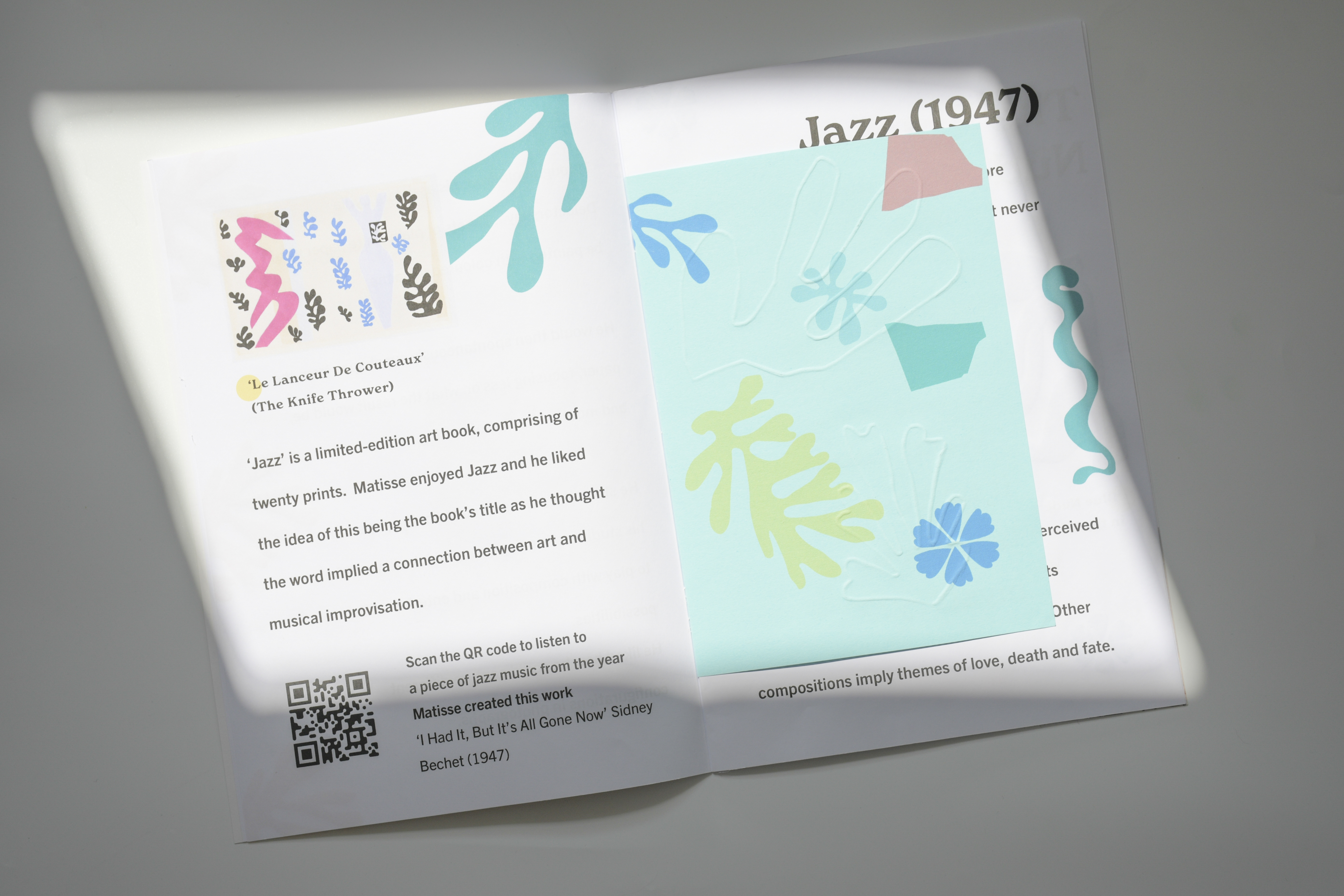
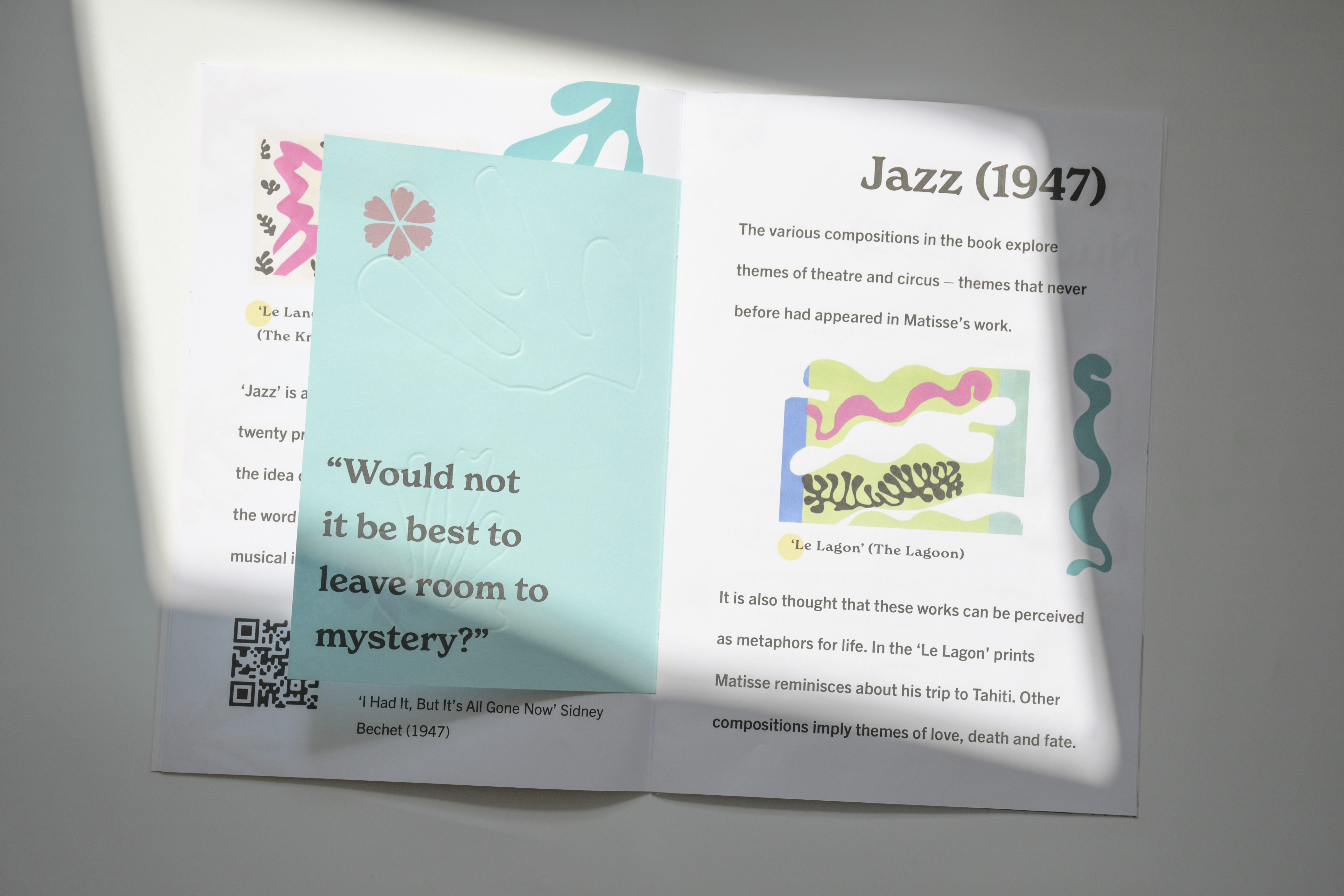
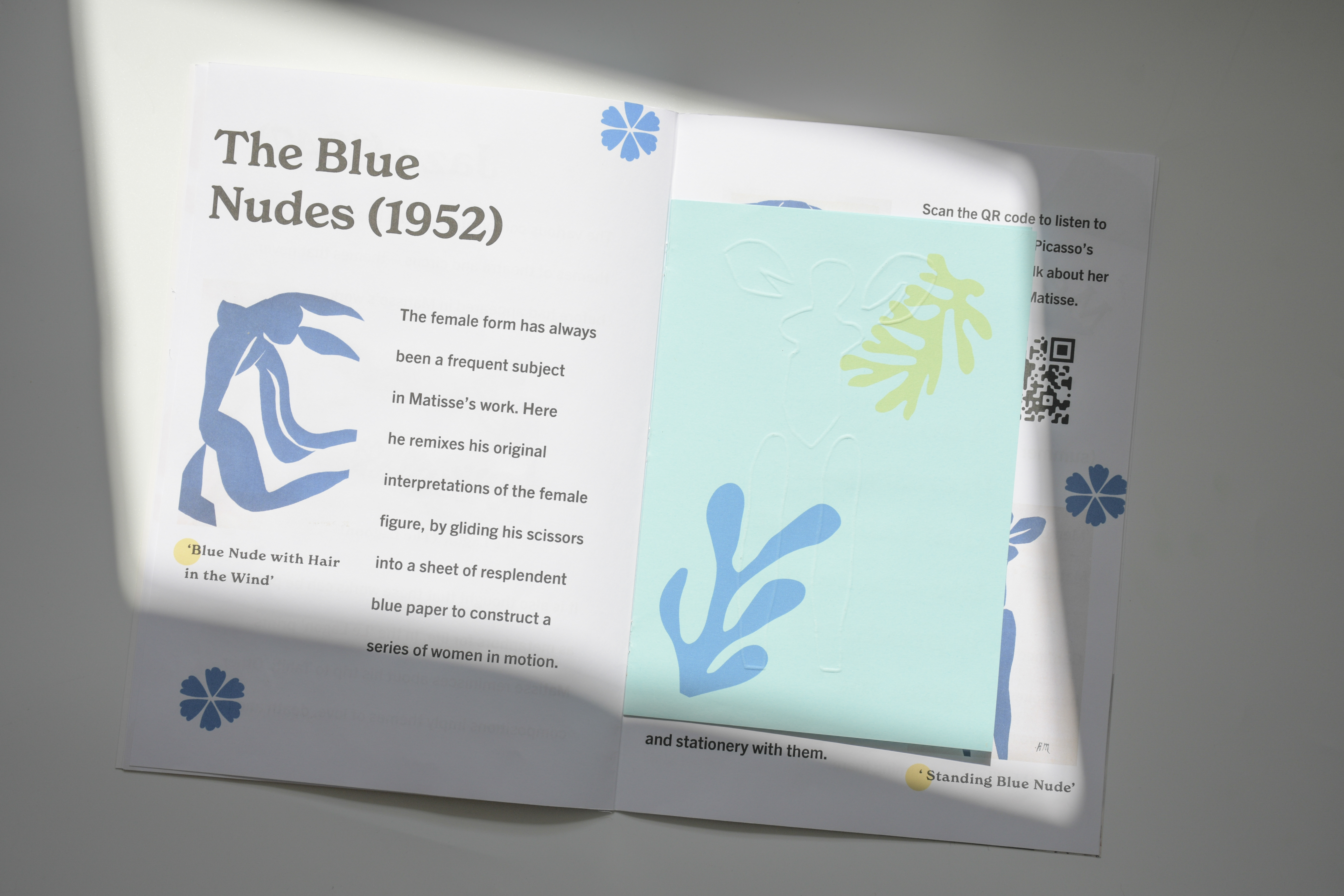
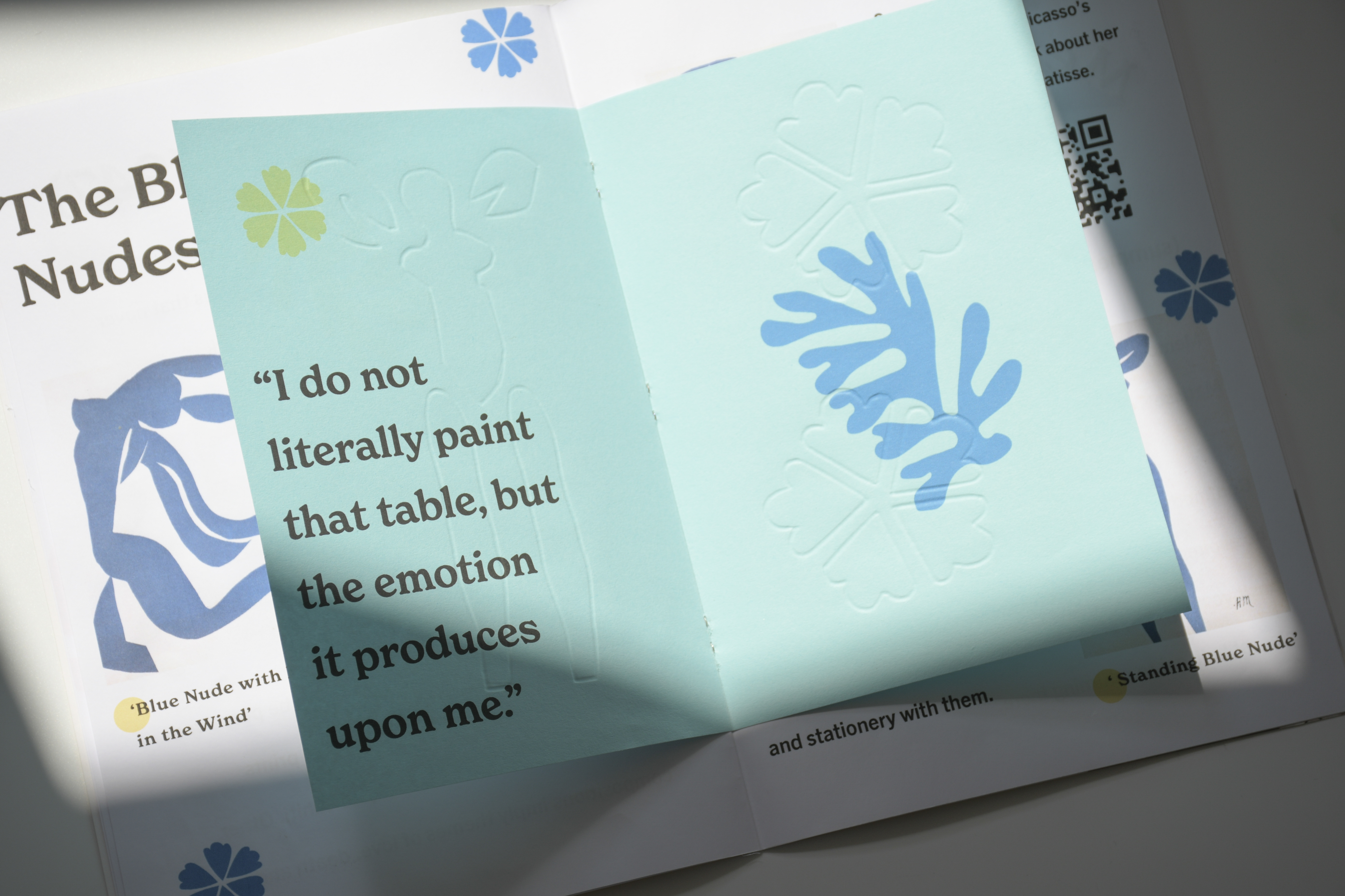
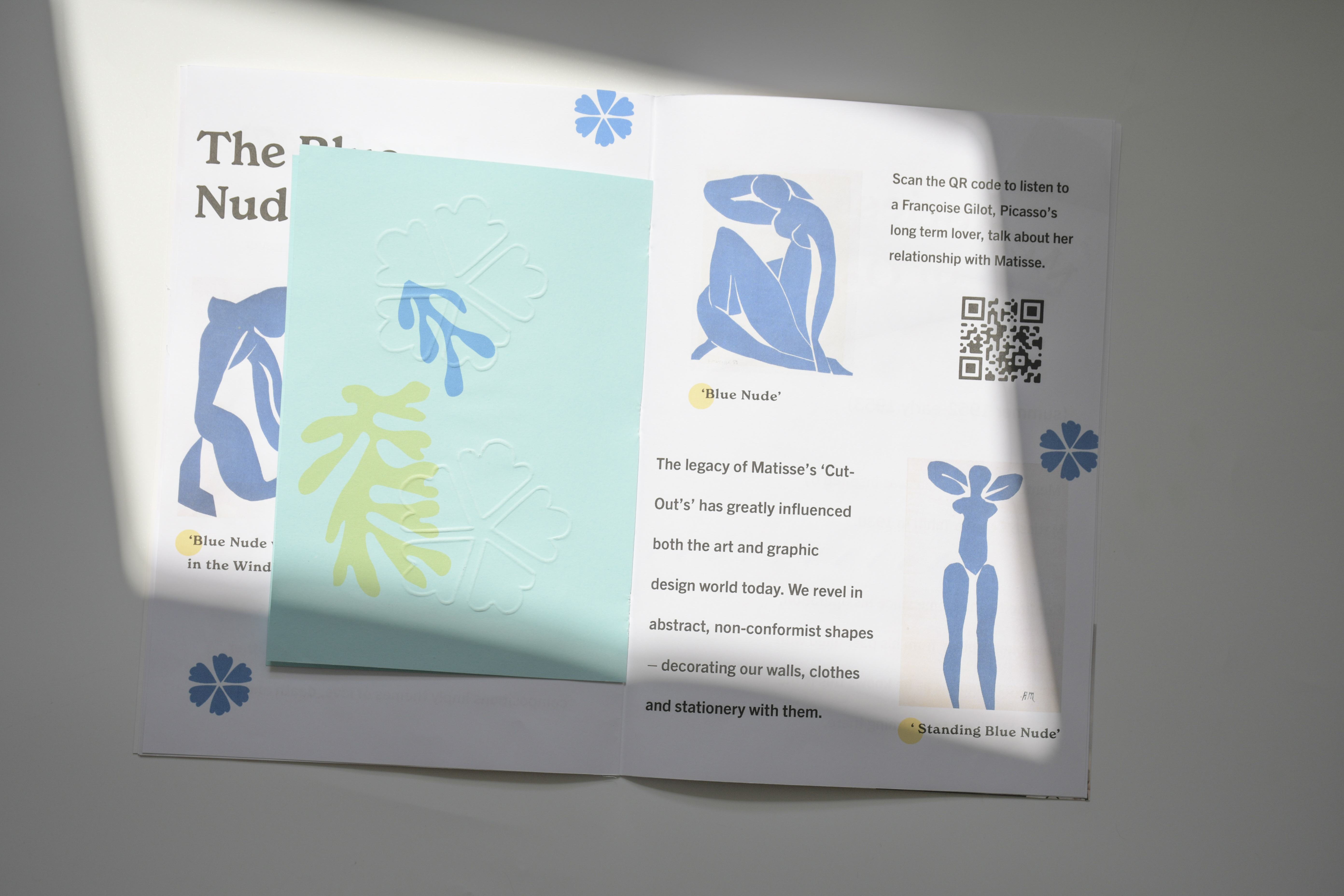

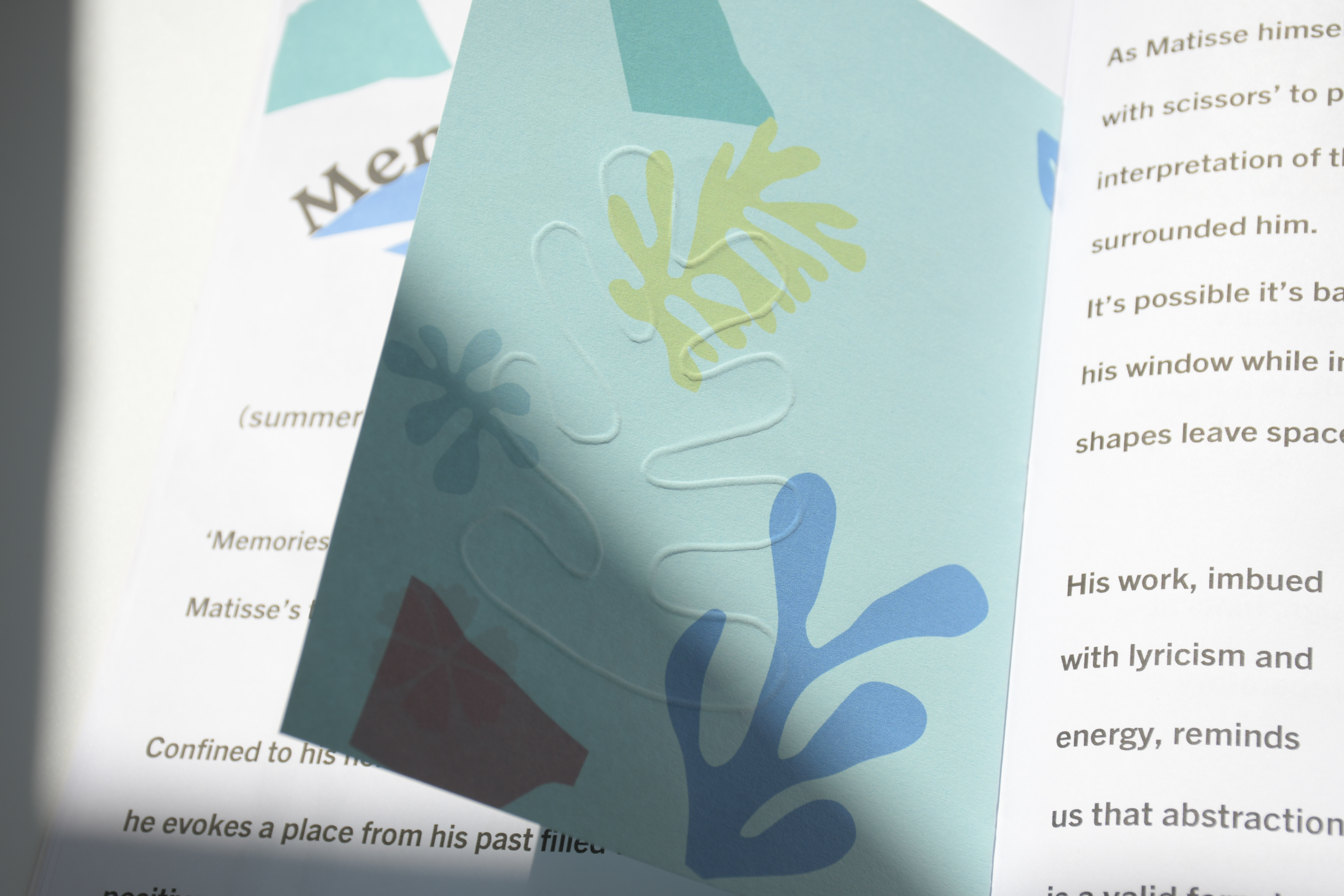

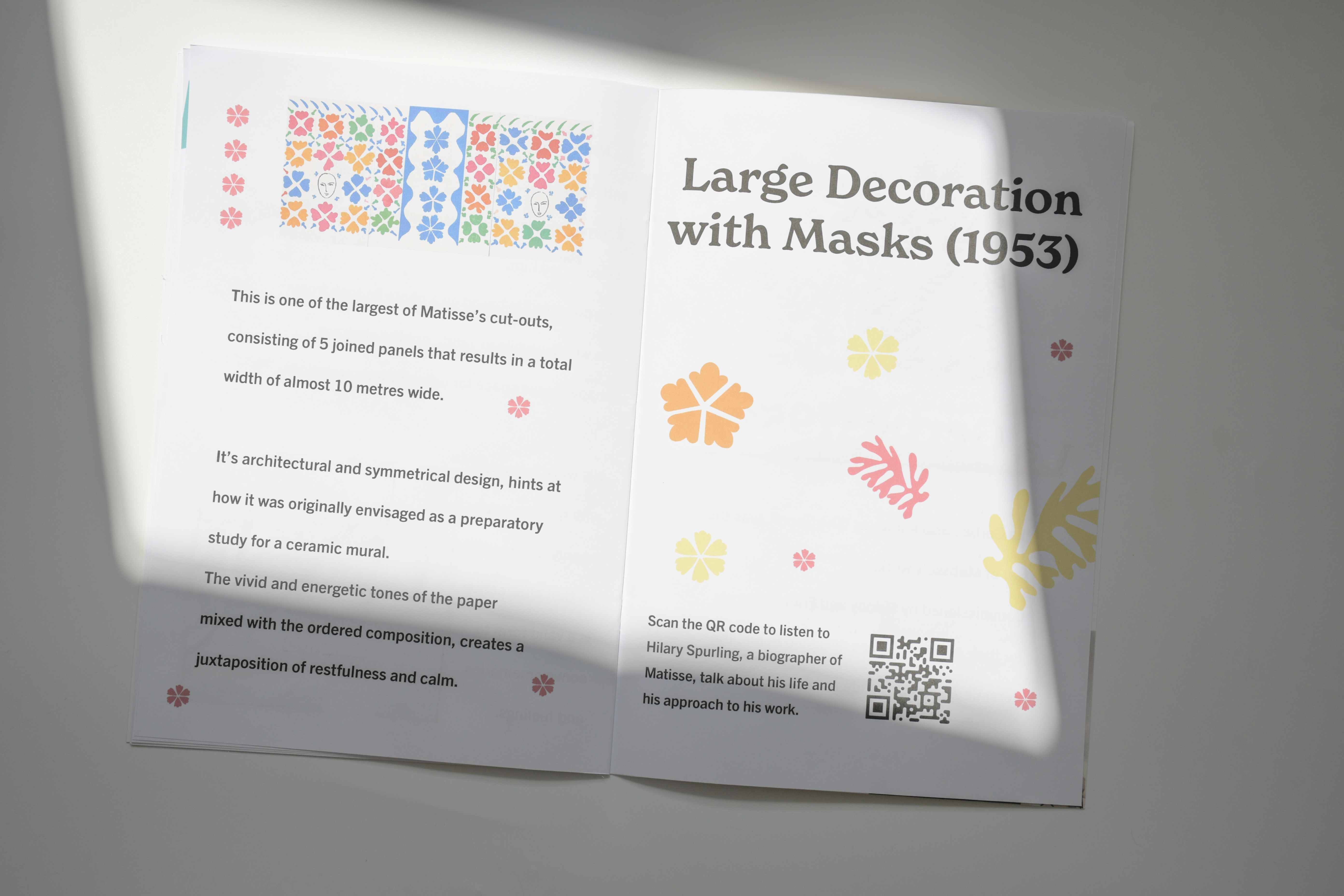
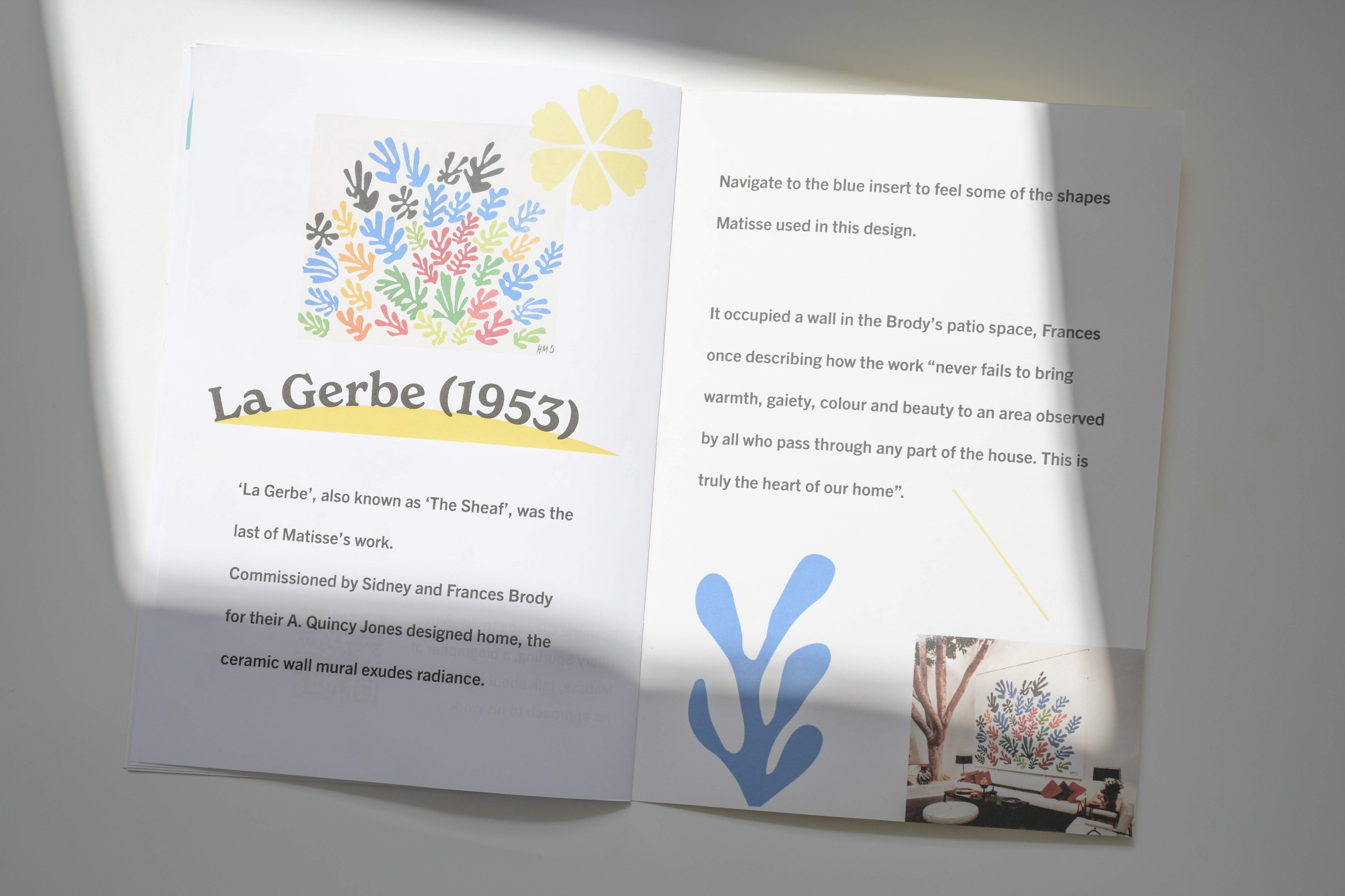
The layout, typeface choice, point size and alignment were all aspects that needed special consideration. Following guidelines created by the RNIB to help with the design of exhibition content for partially individuals, I discovered that all text should be aligned left, line lengths should be a maximum of 50-75 characters and leading should be increased – this aids legibility.
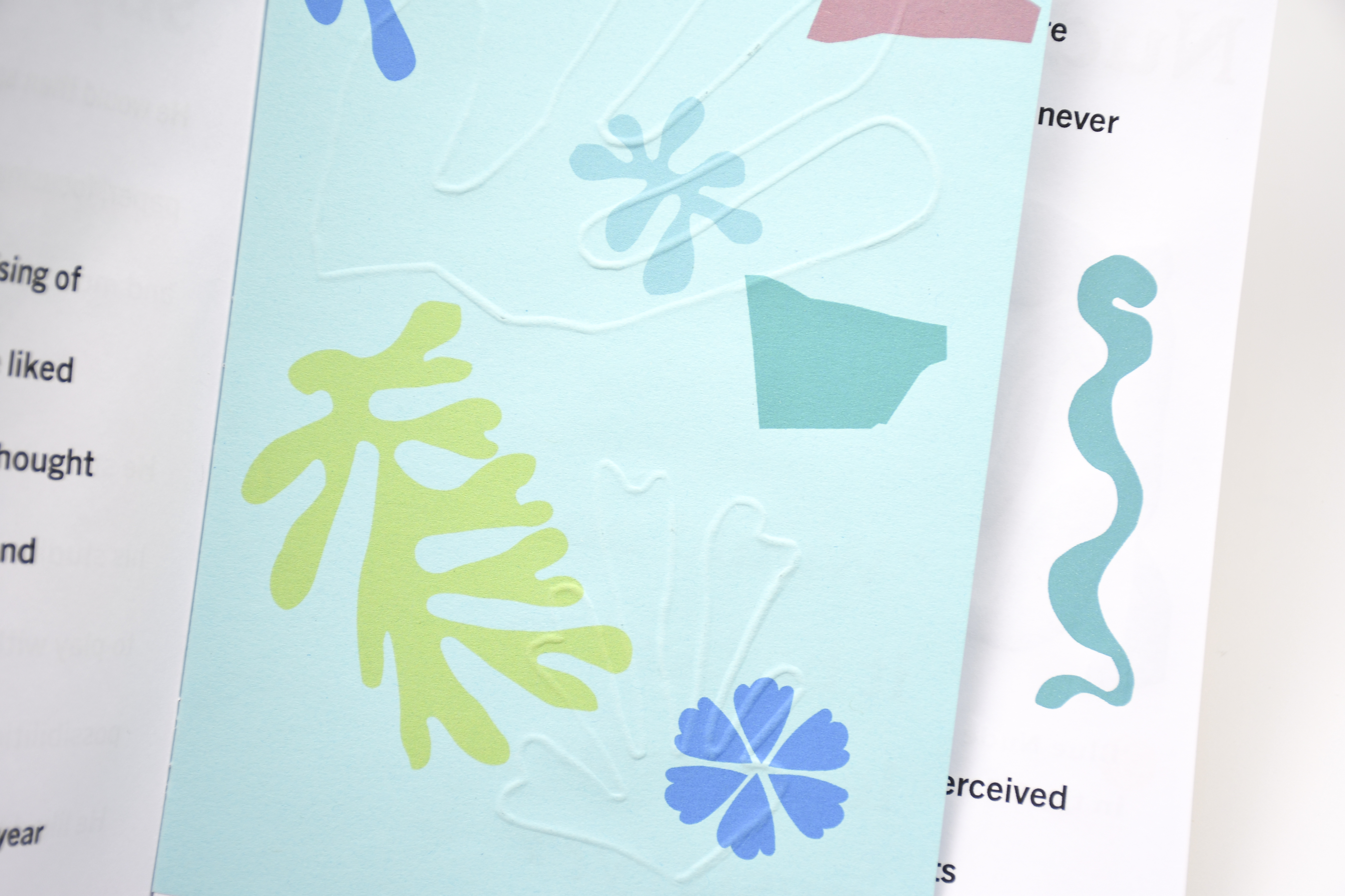

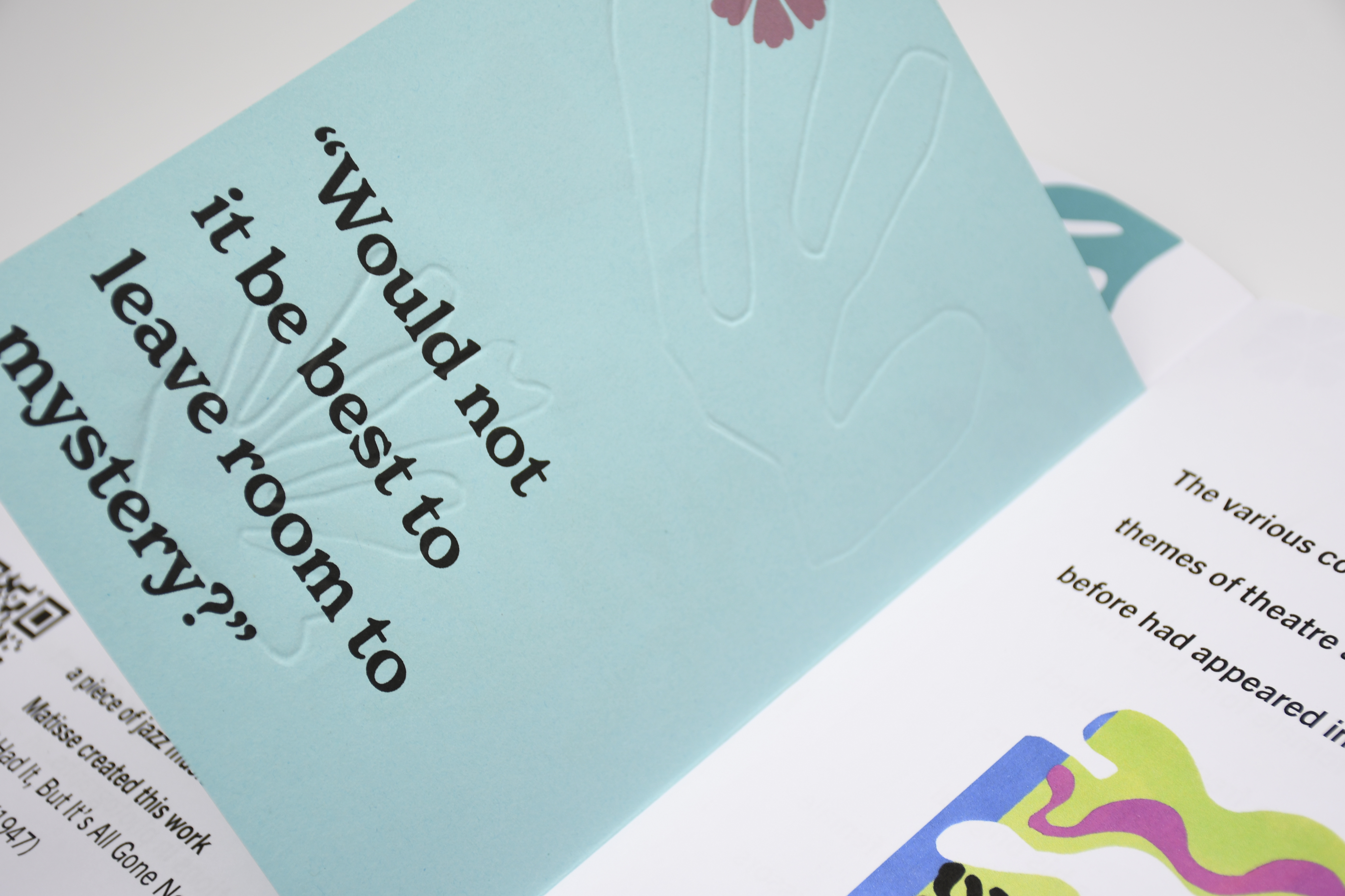
Translating shapes from Matisse’s collages not only adds another layer of interaction for my audience but creates a space for conversations between full-sighted and partially sighted to occur — both individuals experiencing Matisse’s artwork through a different sense for the first time. For legibility purposes, I made the decision for the embossed shapes to be included on smaller inserts. This way the textual narrative wasn’t disrupted.
Through liaising with the RNIB (Royal National Institute of Blind People), I was put in contact with a lovely lady called Vicky, who is registered blind but partially sighted. I sent her a copy of my publication to gain some feedback from someone who fits my audience demographic.
︎︎︎Vicky shared:
“I think it’s a great concept. I like the inserted pictures and shapes throughout and enjoyed looking at the extra embossed pieces of paper. This helped me to make sense of the narrative as I do have some peripheral sight. Embedding the QR codes is a great idea as it offered up some nice audible contrasts and extra narrative which added to the experience. I knew nothing about Matisse so found the narrative very interesting!”